Color is an important component of the interior. Speaking about the interior, one cannot help but touch upon the issue of color or color of the room, since the key aspects of interior design are somehow related to color. For example, the selection of materials for walls, floors, ceilings, the choice of furniture, textiles - all this implies not only the choice of texture, but also color.
When starting work on a project, it is important to lay down certain colors and color combinations so that the resulting interior is pleasing to the eye, comfortable from the point of view of the emotional state of the people arriving in it, and consistent with the function of the room.

When working on an interior design project, we, designers, include a color palette in it and do this not accidentally, but consciously. The choice of color for a given specific space is determined by many factors: ranging from taste preferences our customer, including the purpose of the room, the nature of the lighting, and ending with an understanding of what emotional and physical reactions a particular color combination causes.

An interior designer is able to use color to visually expand the space or, on the contrary, visually reduce it, as well as set the direction of movement of our gaze, that is, to focus the observer’s attention on a particular piece of furniture.

The use of bright color accents adds optimism and color to the interior, emphasizing a particular piece of furniture. Such color spots look especially impressive against a neutral background.

Impact of color
The impact of color on the human condition cannot be ignored, since it affects our mood and health. Knowledge of color science provides significant assistance to the designer in creating and maintaining the desired goal setting, and therefore a harmonious environment for life, recreation and any activity.

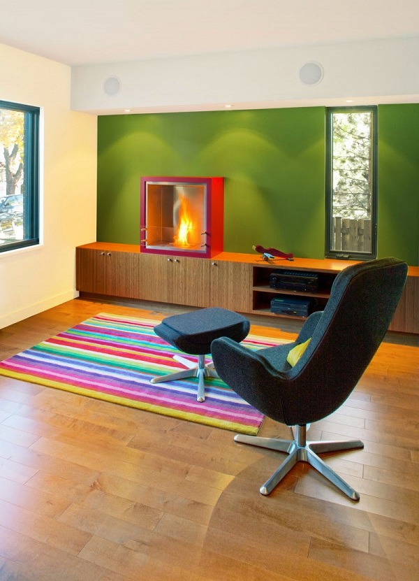
What is a target setting? Each time the designer works on a specific room. If it's a gym, the goal is to maintain physical tone if it's dealing with educational institution, then its goal is to stimulate mental activity, but if this is a SPA salon, then it is logical to create a calm, relaxing environment in it. Photos of interiors (below) demonstrate how using one color or another can create a certain atmosphere in a room.

It is worth remembering that light and color are inextricably linked. The color of the room depends on which side the windows are facing. Northern and eastern rooms receive less natural light and appear darker and colder, while southern and western rooms receive more light and appear lighter and warmer overall. Moreover, the color changes throughout the day as the sunlight is cooler in the morning and warmer in the evening.

How colors are formed
There is such a concept as three-component color mixing, which is well illustrated by Goethe’s color wheel. The sequence of colors in a circle is the same as in a rainbow (red, orange, yellow, green, blue, indigo, violet). There are three main or primary colors in the circle: red, yellow and blue. They form the basis of all other colors. Green, purple, orange are additional or secondary colors that are formed by mixing three primary colors. Tertiary colors or third-order colors: yellow-green, yellow-orange, red-orange, red-violet, blue-violet and blue-green are the result of mixing primary and secondary colors. Their name speaks for itself.

Warm and cool colors
Depending on how colors affect our nervous system, they are divided into two groups: cold and warm colors. If the color wheel is conventionally divided vertically in half, then its left half will contain cool colors, and the right half will contain warm colors.

Warm colors: red, yellow, orange and their derivatives. Warm colors in the interior are also called active - they irritate our visual apparatus. Thus, the color red stimulates action, but a long stay in a room with red walls can deplete the strength of the people in it and reduce their performance.

Cool colors: green, blue, indigo, blue-green, as well as their derivatives. Cool or passive colors calm our nervous system and have a relaxing, beneficial effect on the visual organs. In particular, tonic green appropriate in rooms associated with the learning process and mental work, as it relieves visual tension.

When cold shades predominate in the interior, the color of the room can be classified as cold if they dominate warm shades- we are dealing with a warm color. In addition, warm and cool colors can be used in equal ratio, as if balancing each other.

Color combination
There is an unspoken rule among designers regarding the use of color in the interior: the brighter, richer or darker the color, the less of it should be used. Light neutral colors can be used with almost no restrictions.

The rich color is quite applicable to walls, furniture and the contents of the room, but it is advisable to balance it with more neutral shades of textiles or decor. A common design technique when bright color one or two walls of the room are painted, while others have a calmer pastel color or a neutral white color.

In interior design, contrasting or nuanced colors can be used. color combinations. Nuanced color relationships are characterized by the absence of clear contrasts and sharp color transitions. The contrasting combination is based on pronounced transitions from light color to the dark.

Nuanced combinations are recommended for rooms intended for relaxation or sleep: bedrooms, children's rooms and rooms for the elderly. It is believed that sharp contrast tires our visual apparatus. Contrasting combinations are appropriate in rooms where active activity occurs: living room, kitchen. By using contrasting combinations However, we manage to create interesting, bright, memorable interiors.

The interior of the room can be monochrome or monochrome. Monochrome includes not only black and white interiors, but also those whose coloring is based on one color and its shades (“mono” means one, “chromos” means color). At the same time, white color may well be present in a monochrome interior.

Color is the main aesthetic component of any interior. This is the simplest and at the same time fundamental, and also very effective way transformation of space. It, coupled with lighting, can visually expand or reduce a room, emphasize a particular item, create a certain mood and even influence a person’s physical condition. Knowledge about color and color combinations is necessary for a designer to create not only memorable interiors, but also a comfortable living environment in the house.
Color solution interior no less important detail than the choice of style and materials for decoration. Colors can transform a room beyond recognition; not only the harmony of the decoration, but also the mood of the people in the room depends on the correct selection of colors. When selecting shades, it is necessary to take into account the purpose of the room and even the location of windows - the number sunlight greatly influences the perception of tone.
Room design color scheme

Combination of white and blue in the interior
Globally, the entire spectrum is divided into two large parts - warm and cold.
- Warm colors include red, orange, yellow, violet with a predominant red, as well as all derivatives. Some varieties of green also belong to the summer half of the spectrum; this is easy to understand by the presence of an admixture of yellow. In areas where there is little natural light, choose finishes and accessories in the warm spectrum.
- All types of blue and cyan, turquoise, lilac, etc. are considered cold. At the same time, the cold group is best used in the interiors of rooms facing south. They always have a lot of light, and in summer cool colors can refresh the design. But for northern rooms there is no need to select blue or light blue as a finish, especially in combination with snow-white. This combination will look lifeless.
It is also important to know about visual effects. Objects painted in summer tones visually appear closer, unlike objects in the cool spectrum.

Bedroom interior in black and white

Bedroom in white
Possible combinations
The color scheme of the interior can be chosen based on contrast or, on the contrary, it can be more calm and nuanced. In the first case, shades predominate that are harmoniously combined, but at the same time are at opposite ends of the spectrum, for example, pink and turquoise, red and green, etc. In a nuanced combination, colors from the same group are selected, for example, several types of green.
The selected combinations can influence the perception of space. Contrasting colors, especially black and white, will visually make the room smaller, so they are only suitable for large areas. There is no need to choose many colors; two or three are enough for the background. An overly bright and variegated combination will quickly tire your eyesight.

Room design in light colors
Using shades in design
When choosing color range it is also necessary to focus on psychology - it is known that different combinations capable of influencing mood. What effect can different colors have?
Red
The first associations that come to mind are energy, passion, aggression, strength, fire. Scarlet is very strong emotionally; it is not appropriate in large quantities. It is best used as accents - in accessories. Red is good when it means active pastime. This is an excellent choice for the living room, but it is contraindicated in the recreation area and children's areas. Of all the styles, scarlet is most suitable for the avant-garde, but even in this case it is practically not used as the main one. It is not recommended to combine with orange.

Bright room design

Dark colors in the living room interior
Yellow
Associated with summer, sunny days, joy. It goes best with emerald green and looks good with lilac, gray, blue, and snow-white. But with scarlet or carrot it should be used extremely carefully, such a tandem is too bright and active. Golden varieties of yellow are suitable for any style, but you should use its pure variety with caution, the brightness will strain your eyesight. IN residential buildings And in apartments it is better to choose softer options - golden, ocher.
Green
Symbolizes health, life, spring, nature as such. It has many varieties, each of which has its own characteristics. The most famous are salad (green with a clear admixture of yellow), emerald and aquamarine. Salad is most associated with lightness, early spring and carefree joy. This delicate shade Suitable for most styles, but even in this case you should avoid overly saturated varieties.

Color solutions in the living room interior

Light bedroom design
Emerald
Beautiful rich tone, calm and peaceful. Thanks to these properties, it is well suited for areas intended for work or relaxation - home office, library, bedroom. Good for almost all styles.
Aquamarine
It is closer to the blue spectrum, reminiscent of the sea and cool wind. Due to the obvious admixture of blue, it can cause a drowsy mood, so it should be used very carefully in the office or hall. And here is the bedroom perfect place for blue-green.

Combination of light green and purple in the kitchen interior
Blue and cyan
A calm palette, first of all, evoking associations with the sky and sea. Blue-blue colors are suitable for recreation areas and children's areas. Goes well with white, amber, honey, gold, orange, emerald, gray.
Brown
It is a symbol of the earth and trees, considered neutral, combining with almost everything. Light brown and beige are a great backdrop for any decor. Do not overdo it - such a base must be diluted with more saturated tones, otherwise it risks becoming monotonous, especially for beige.

Beige color in the interior

Bright room design
Violet
Creates a mystical atmosphere, but is highly not recommended for apartments due to the fact that it causes depressive moods. Purple must be selected very carefully and only in small quantities.
Lilac
More soft version, however, you shouldn’t get carried away with them too much. Lilac is good for bedrooms, but it should be used with caution in the living room, nursery or kitchen.
Pink
Light and gentle, but some varieties, such as fuchsia, can be very aggressive. Hot pink can be chosen for the living room, but pastel varieties are suitable for the recreation area and children's areas. Combining with orange is highly not recommended; the resulting tandem is too bright and psychedelic.

Combination of white and red in the interior

Beige color in the living room interior
Black and white
The most versatile and at the same time controversial duet. Both black and snow-white can be combined with any shades, but are used only as additional ones. Black as the main color is too gloomy and depressing, and white will turn your home into a hospital ward. It is also possible to use them at the same time, but this is a very risky step. You should monitor the proportions and avoid a 50/50 ratio, it looks too sharp.
It is important to understand that associations are purely individual. For some, the abundance of lilac makes them sad, but for others, on the contrary, they will like it. When choosing an interior color scheme, the correct one will be based not only on generally accepted rules combinations, but also according to your own taste and perception.

Bedroom in bright colors
Dependence on the direction of the world
As mentioned above, the choice of combinations also depends on the side of the world to which the windows face. The reason is the amount of natural light, in other words, insolation. This greatly affects your physical and mental well-being. Dark and gloomy apartments, where they practically do not go sun rays, cause discomfort, fatigue, drowsiness, they face west and north, this must be taken into account when choosing colors.
On north side Amber, honey, red, peach, golden beige are appropriate. These colors are associated with warmth, which is so lacking especially in winter time. Turquoise, mint, lilac, grey, indigo, blue and white are not best choice, since they will visually make the interior even cooler.
The eastern rooms are always well lit, especially in the first half of the day. You can use both warm and cool colors in your design, but it is important to avoid pale ones. pastel shades. Due to the fact that there is no sun on the eastern side in the evening, they will look faded and dirty, taking on a grayish appearance.

Bedroom interior in blue tones

Bedroom in dark colors
WITH south side there is always a lot of sun even in winter period. It's always warmer and hotter here, so the cold spectrum can be a real salvation. Turquoise, aquamarine, mint different proportions can create a feeling of coolness. Moreover, if in eastern apartments saturated colors are more appropriate, but in the south, on the contrary, try to select pastel options for decoration.
Warm colors are suitable for apartments with windows facing west. Since there is little light in the west during the day, it is necessary to avoid dark colors, as well as pink and lilac - they will appear gray and faded in the absence of sun. As a last resort, when using such a finish, take care of high-quality artificial lighting. For finishing on the western side, you need to choose colors with great care, since the slightest miscalculation can turn beautiful design into gray and faded.

Bright room interior

Light green color in the kitchen interior
Recreation area
Since this space is intended for sleep and daytime rest, the color scheme of the interior must correspond to the task. It is best to choose calm colors, both warm and cold. Too bright colors, as well as black and purple, have no place here even as accessories. Be sure to pay attention to the lighting. On the north or west side, warm colors are more appropriate, while on the south, cool colors are appropriate.
Using color, you can not only correct lighting imperfections, but also slightly change the visual perception. Light combinations visually expand the room, while dark and rich ones make it smaller. The same effect comes from contrasting decoration and furniture.

Light colors in the interior of the room
Kitchen decoration
First of all, it is important to understand what function, besides cooking, is assigned to this room. How often do you go into the kitchen, cook at home, or invite guests? Is the kitchen combined with the living room or is it isolated? Is it big or small? The further design of the kitchen depends on the answers to these questions.
IN small kitchens it is preferable to use light combinations - vanilla, milky, beige, light gray, mint, soft pink, etc. But in large rooms and even more so in studio apartments, you can use brighter and more contrasting options. If kitchen area combined with the living room, it can contrast with it or harmonize with it. Contrast is convenient if you need to visually distinguish between the kitchen space and the living room.

Combining colors in the bedroom interior

Room interior in black and white
Hall decoration
Most often, this is a room in which a lot of time is spent every day. The family gathers here in the evenings, as well as get-togethers with friends and family dinners. For this reason, the selection of a palette must be approached with the greatest seriousness.
- In spacious rooms you can safely implement any combinations. In such a room there can be more than 3 colors, more more difficult to combine with each other.
- The use of dark colors is appropriate for hi-tech or minimalism, but in classic interiors Light colors look much more harmonious.
- If light combinations are chosen as the basis, it must be diluted with bright details to refresh the decoration. This could be furniture, for example a carrot sofa in the background beige walls, or accessories - curtains, vases, photos and paintings, sofa cushions, bedspreads, etc.
Hallway decoration
The corridor is a place without windows, so the palette here is very limited. The hallway is also rarely impressive in size, so white or beige are most appropriate. If desired, you can choose azure, green or yellow, but then the electric lighting must be impeccable. In cool white light, bright palettes will appear darker, while golden lamps hardly distort them.

Room interior in light colors

Bedroom in bright colors

The color scheme of your home is one of essential elements interior Color is present in everything finishing materials and decoration elements. The choice of color is influenced by mental and emotional state residents, their lifestyle and expectations regarding their apartment. A person can perceive his home as a place of relaxation, solitude and peace, he can look for inspiration in it or a powerful charge of energy that would be enough for the whole working day.
In addition, when choosing the main color, as a rule, this is the color of the walls, you should keep in mind the relationship of the color with the size of the room, its purpose and functional load, as well as take into account other elements of the interior, such as the color of the floor, furniture, textiles and accessories.
To begin with, let’s look at the main rooms in the apartment from the point of view of their functionality and determine the most successful interior color schemes.
Living room
 The living room in a “densely populated” apartment is a permanent place for all family members to relax, so its color scheme should be clear, calm, conducive good mood– golden, yellow-green, gray-blue, gray-green and other warm and cold colors of low and medium saturation can be used here. In sparsely populated apartments and large manor houses, the living room is used relatively rarely - mainly for evening relaxation and receiving guests. Therefore, it can be solved in rich colors that contribute to an uplifting festive mood(such as magenta, blue, violet or ochre).
Kitchen
 The kitchen is traditionally designed in light colors, which makes it possible to maintain it in proper sanitary condition. The most desirable wall colors for a kitchen are washed out blue or blue-green, creating the impression of coolness, spaciousness and cleanliness.
IN small apartments, where the kitchen also serves as a dining room, more saturated shades can be used, and the color of some elements can be very intense. At the same time it is light kitchen equipment stands out beautifully against a dark background and the kitchen looks elegant.
 All “edible” colors that evoke positive associations would be appropriate in the kitchen. But remember that combinations of yellow and orange with red perfectly stimulate appetite and can cause overeating. If you want to keep your weight under control, use green, lettuce, mint or green in your kitchen interior. pistachio colors, and fashionable saffron accessories will add warmth and comfort.
In studio apartments, the kitchen is part of the living space and should be more strict and formal, in in this case The more neutral the kitchen area is, the better. Leave contrasting solutions for the recreation area.
Bedroom
 The bedroom is usually a place of rest and relaxation. The main task is to create an atmosphere of complete calm. She is answered by warm, calm, fairly whitened yellow and blue tones. If the bedroom also contains workplace(a schoolchild or student’s room), then light gray-green, gray-blue and other neutral colors are recommended that promote concentrated mental work.
 In the marital bedroom there must certainly be a place for romance and passion. Painting all the walls red is not the best good option, but decorating the wall behind the head of the bed is a good way out. The fact is that while lying in bed, this part of the room is practically invisible, and it will not interfere with falling asleep, but outside the bed this wall will attract the eye and set you in a romantic mood. You can paste wallpaper with an intense but not irritating pattern behind the head of the bed, place a bright painting or poster, paint this wall in a more saturated shade than the main color of the walls (a combination of sand and chocolate shades), or, on the contrary, choose a contrasting color (muted burgundy or lilac , bleached pink, golden orange). The color chosen for the headboard can be supported in accessories and textiles, but in calmer shades.
A bedroom for older people should be designed in calm colors, without sharp contrasts. There are people in this room long time, therefore its color should promote calm and comfort.
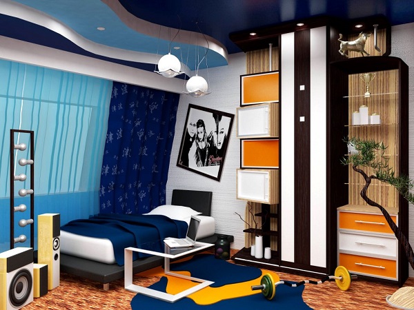
Children's
 A room for children should create a joyful atmosphere that stimulates their life. However, despite the craving of children for bright, saturated colors, their use in the children's room should be moderate, since it has been established that these colors, when exposed to a child for a long time, have a strong effect on the psyche and tire. It is recommended to paint the nursery in calm, muted tones (white, bleached green, ocher, blue, gray), and include bright rugs, bedspreads, upholstery, cabinet doors, etc. in the interior.
As the child grows, the number of bright details should be reduced, since the child’s brain no longer needs external stimulation as much and requires more and more calm to process information and comprehend what he saw and experienced during the day. And don’t forget that the baby’s room should “grow” with him and meet the needs of the little resident.
Cabinet
In the office, calm brown, beige, green and gray colors promote concentrated mental work.
 Hallway
The hallway and corridors are usually rooms limited sizes where it's missing daylight. To visually correct these shortcomings, their walls are painted in light colors, creating some illusion of a larger room.
Light wallpaper with horizontal stripes used to visually lengthen space. The vertical pattern creates the impression of a higher room.
Bathroom
 A very important room in any apartment. Here we start a new day, here we get ready for bed, and it is very important to understand what meaning this room will carry in our lives. If you have trouble waking up and feel groggy in the morning, don’t be afraid to use bright and cheerful colors in your bathroom. Orange and light green will give you a boost of energy and help you get ready for the work day.
 If, on the contrary, you find it difficult to fall asleep, the bath should become a place of relaxation and peace. Combinations of beige and coffee with milk, shades of sand and chocolate flowers, all muted shades of warm colors.
A sanitary unit is usually small in size, so to create the impression of a slightly larger space, its walls are painted (or lined) with clean, very light-colored paints, but a certain mood is created by decor and accessories.
Creating the design of any space begins with color. Deciding on general style premises, the designer already imagines it in certain colors, since they are the ones who direct the imagination in the right direction. The combination of colors in interior design is one of the factors indicating the style and theme of the room. Country style is dominated by noble rich tones, all shades of wood, white, beige, burgundy, brown. To create the Provence style, we use pastel colors with a slight splash of dark shades. The “marine” style is indicated by blue, white, gray, light blue and the color of dark wood. Classic characterized wide range beige, chocolate, coffee. Ethnic style plays with contrasts, using brown, bardo, black, red. The choice of colors is the most important stage, on which the success of interior design as a whole depends.
The joke that all men see only 16 colors, as in the default Windows settings, has real roots: there are many more “color-sensitive” cells in a woman’s eye.
However, as research shows, the human eye is capable of perceiving huge amount colors and their shades: about 250 pure and more than 10 million mixed.
A simple understanding of the colors of the main spectrum will help you not to get lost in such diversity.
There are only seven of them: red, orange, yellow, green, blue, indigo, violet. Taking these colors as a basis, diluting them or mixing them with each other, colorists create a huge number of tones and shades for use in the interior. To these are added the so-called achromatic colors, that is, not carrying any color meaning. There are only three of them: black, white, gray.
All colors can be divided into two groups: warm and cold:
The feeling of warmth is caused by red, orange, yellow, and all their various shades. Warm colors are used to make a room more comfortable, add light to a poorly lit room, or correct too much empty space.
The feeling of coolness is evoked by blue, violet, cyan and their various tones. Cool colors are suitable for well-lit rooms, they will visually expand the space and add freshness and vigor.
How to choose the right harmonious combination of colors in interior design?
Choosing colors and their combinations is a complex process that sometimes baffles even professional designers. But with the help of a universal, easy-to-use color wheel, anyone can now cope with the correct selection of colors. You just need to remember that within one room you should combine from three to five colors, no more.
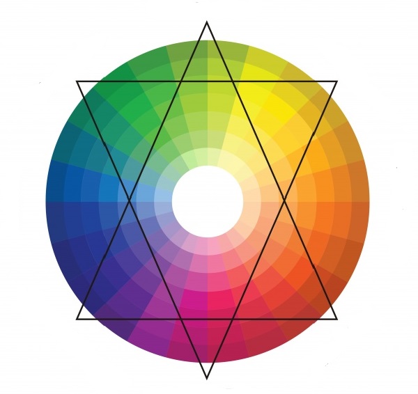
Color wheel
1) Several shades of the same color
This is a proven and reliable method for calm natures who do not like to take risks too much. The room is “filled” with all sorts of shades of the same color: from the deepest, most saturated to the lightest, barely visible. Smooth transitions and a guaranteed successful combination will give the interior calm, harmony, and tranquility.
2) Playing on contrasts
A method radically opposite to the previous one. The basis is taken of two contrasting colors located opposite each other on the color wheel. Contrasts are played out in the interior using neutral colors such as black, white, gray.
3) Harmonious combinations
One of the colors in which you would like to decorate the room is taken as a basis. Two more are “attached” to it, located to the left and right of it on the color wheel. In this case, the colors will form an original and beautiful combination, without sharp transitions.
4) Three spectacular colors
A somewhat bolder move, but without being too flashy. A triangle is used to identify three colors that successfully combine with each other. It can be rotated within the circle until the angles indicate the most pleasing combination to the eye for each individual case.
Rules for choosing colors for different rooms
The influence of color on a person’s mood and emotions has not been a discovery for a long time. That is why you should very carefully select colors for interior decoration, depending on the purpose of the room.
Bedroom
It is not recommended to decorate the bedroom with sharp contrasting colors, since this place is designed to relax and soothe. Pastel colors and soft shades are perfect here. Warm colors are preferable, but cool shades can also be used if the room is small and the windows face south. Well-chosen accessories, the addition of white, and the correct placement of accents will help bring coziness to cold tones.
Living room
In the interior of the living room, you can be bolder with the choice of colors. Playing with contrasts or using eye-catching accents will add vigor and give the interior a stylish, eye-catching look. If the windows face north, you should take warm shades as the basis for the interior. If the living room is too small, you can “expand” it a little by using a light, cool palette. It is important to consider that cool tones are only good for bright rooms where the sun does not leave the room for a long time.

Color is one of key points in the design of any room. Therefore, when planning to renovate your home, pay due attention to the color design of each room.
The color scheme of the interior of your home should be harmonious and at the same time creative, emphasizing home comfort and hiding possible design flaws. So, let's look at the features of choosing colors for each room.
Bedroom interior color scheme
The bedroom is intended for relaxation, so it is advisable that the walls, ceiling and pieces of furniture are designed in calm, soft colors. Aggressive black and red colors have no place here. The lighting of the room plays a big role in choosing the main color (and this applies not only to the bedroom). If the room is relatively dark, and its windows face north, west or northwest, it makes sense to add warm colors. Thanks to this, your bedroom will become visually brighter and more comfortable. If it is oriented to the south or east, you can decorate the interior in cool colors. This is how you will achieve visual expansion rooms. This move will also be successful if the bedroom is long and narrow (this is typical for many apartments in old buildings).
Kitchen interior color scheme
First, you need to decide what the role of this room is in your life. You can step into the kitchen twice a day to make coffee, or spend entire days preparing delicious home-cooked meals. Differences in layout are also important kitchen space- either this is a spacious studio combined with a dining room or living room, or a standard “Khrushchev” kitchen. Depending on these factors, the choice also changes. color design premises.
As a rule, a small kitchen is visually enlarged by using cool colors. Use light ones pastel colors– they seem to move objects away. A larger kitchen can be decorated in a folklore style, which will original solution in the interior and will give extraordinary comfort. Colors within the same color scheme (such as brown, beige and sand) can be used to create the impression of comfort and warmth of the present hearth and home in the kitchen.
 |
 |
 |
 |
Living room interior color scheme
The living room is the “heart” of every home. Here we receive friends, here we spend most of our time, enjoying relaxation and communication with our family. Therefore, the choice of color scheme for the interior of the living room must be approached scrupulously.
In a spacious living room, feel free to use contrasting tones, and their ratio does not have to be 1:1, rather the opposite. There may be 2-3 or even more flowers, but then you can’t do it without the help of a professional.
Dark colors It is worth using only if the interior of your living room will obviously be designed in a minimalist or hi-tech style.
If you have opted for a light-colored living room design, choose several bright elements, on which it is better to focus. This can be either a piece of furniture (say, a bright red sofa), or simply a valuable thing (a large antique vase, an expensive painting). Decorate the windows with curtains in rich shades - an interesting color scheme will help highlight the source of natural light in the interior.
 |
 |
 |
 |
Color scheme for the hallway interior
The hallway is usually a room without windows, so the choice of color is especially important here. Consider the lighting of the room and its uniformity. You can create a hallway in a strict classic style– brown, beige, white. Or decorate the hallway in bright red, blue, yellow, fresh blue, turquoise or neutral colors (all pastel shades).