There are several basic rules for color combinations: complementary, divided-complementary, analog, monochrome, achromatic and the classic triad.
You will learn how to correctly combine colors in clothes so that your outfits always look organic by reading this material.
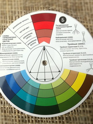
Color wheel: rules for harmonious combination of colors in clothes (with photo)

The color wheel for combining colors in clothes is the basis for a woman who knows how to harmoniously combine colors in her wardrobe. It consists of three primary colors: yellow, red and blue. All other colors, and there are 12 in total, are obtained by mixing. Mixed yellow with red and got orange; yellow and blue - got green; blue with red - got purple. And then to combine colors in the color wheel, we mix yellow with orange - we get yellow-orange; yellow with green - we get yellow-green; blue with violet - blue-violet, etc. Further up, two tones, the color becomes darker, thicker and more saturated, and down two tones - blurry, lighter and right up to the palest. Thus, we get the violet sector: blueberry, eggplant, violet, dark lilac, lilac, pastel lilac. But these are not all shades of purple. In fact, there are dozens of them, but the principle of their lightening or saturation is now clear to you. In addition, if the color wheel is divided diagonally from yellow to violet, we get a warm (yellow, yellow-orange, red-orange, red, red-violet) semicircle, and from violet to green-yellow we get a cold (violet, blue-violet) semicircle. purple, blue, blue-green, green, green-yellow).
Thus, we may have a question: what about green, the warm color of young greenery, because it is in a cold semicircle? For this purpose, we are given a color range from saturated to the most pale, each containing more than five shades. So you can consider that your warm green is in it too. Warmth and coldness belong only to those basic 12 colors obtained as a result of mixing and are a formality.


How to use the color wheel and the rules for combining colors in choosing a harmonious ensemble and interesting image? The first thing you need to remember is which colors suit you best based on your appearance color type, as well as how you want to look in the eyes of the people around you, and what impression you want to make.
But before you start studying the issue in detail, look at the photo color wheel to combine colors to better understand what we are talking about:


What combinations are harmonious: complementary colors
The first rule of color combination is a combination of opposite colors or a complementary combination. Simply put, it is a combination of two colors based on contrast.


What color combinations are harmonious according to color theory? Every cool color harmoniously combines with the warm color opposite it. Always remember that we're talking about not only about the main color, but also about all its shades. Draw a diagonal from your chosen color sector to the opposite side of the circle, and you will see combinations that combine perfectly with each other.


How to combine colors correctly using a specific ensemble as an example? Imagine: a cool emerald green dress and, in addition, a warm cherry red bag; cold raspberry sundress and warm light green accessories.


A complementary rule for combining colors in clothes is a combination with high contrast.


To look fashionable, modern, bright, rich and confident, choose an ensemble so that one color is clearly dominant, and the second concerns only accessories (shoes, jewelry, belt, headdress, etc.).
Principles of harmonious color combinations: monochrome


A monochrome color combination is a combination of two different tones of the same color. "Mono" means "one", and harmony is created within one sector. The main rule of monochrome when putting together an ensemble is to step over several shades.


If we take standing nearby shades, they will merge. This principle of a harmonious combination of colors within one sector is based on the contrast of light with dark, light with bright.


For example, if you combine red with burgundy or chocolate with brown, the result will not be the best. If you use light peach fabric for the blouse and chocolate for the trousers, the combination will turn out great.


Thus, we will combine: purple with light lilac, burgundy with pink, bright blue with light blue, olive with light yellow, etc. If you wish, experiment with three shades.
Look at the photo on how to correctly combine colors in clothes: with a monochrome combination of colors, your image will be less contrasting, and you will look noble and elegant:


Make sure that one of the items in your ensemble, located closer to the face (blouse, jacket, dress, pullover, etc.), has a cold or warm shade that matches your color type.
The main rule of color combinations: related harmony
One of the main rules of color combinations is analogue or related harmony. With an analog combination, the colors complement each other perfectly, and your image will be calm, inviting, and sophisticated.


This is a combination of two or three colors located next to each other. The color combination is low contrast, and the combination is soft and calm. Having selected 2 or 3 adjacent sectors, determine the main complementary and accent tone. Be sure to use shades of color that are different in brightness.


For example, from two sectors - violet and red-violet - for a dress we will take a dark lilac shade, and for a jacket worn over the dress - pale pink. From three sectors - blue-green, blue and blue-violet - you can create the following ensemble: a blouse of color sea wave, blue-violet trousers and a blue scarf. From three sectors - green-yellow, green and blue-green - we get a wonderful ensemble: a skirt and jacket in emerald green, a blouse in a light green-yellow shade and accessories (bag, shoes, bracelet) in dark sea green.
The right combination of colors in clothes: the classic triad
A harmonious combination of colors - the classic triad (or triangle rule) - is a combination of three colors located at the same distance from each other. Mentally draw an isosceles triangle inside the color wheel. Its three vertices will fall into three different sectors, and these colors will complement each other perfectly. It is also worth choosing one dominant color, and the other two - complementary and accentuating. Thus, from three sectors - orange, purple and green - we get: an emerald green short coat, dark purple trousers and a scarf interspersed with orange, bright orange.


Three sectors - blue, yellow, red - will allow you to create an equally interesting combination: jeans in dark blue, a pullover in light yellow, and a scarf, shoes and other accessories in pink.


The classic triad is one of the brightest and most harmonious color combinations. Feel free to experiment and you will look impressive, but boldly and always stand out in the crowd.
Divided-complementary color combination
A separated-complementary color combination is a scheme in which one color combines perfectly with two opposite colors that are close to each other. This combination option is very versatile as it has several approaches. If you choose one main color, for example, a raspberry dress, then complementary accessories would be a dark green scarf and shoes with a sand-colored bag. If your dress or dark green, then a pale yellow blouse and ash pink accessories would be a great addition. Thus, the main dominant color from the color wheel for a harmonious combination of colors can be any of the three sectors you choose.


A separate-complementary color combination is perfect for women who want to look sophisticated, bright, and optimistic.
Rectangular, hexagonal, square and others
This color combinations, including more than three colors. To combine shades here, you need special skill and professional flair, precise adherence to the balance of the main and additional colors.
What to wear with what: the right achromatic color combination
Achromatic color combination is building an image around black, white and gray colors, without using other colors.
A more reliable combination when working with black, white and gray is harmonious combination. This combination looks very elegant, calm, and the colors seem to blend into each other without much contrast. For example: gray - pink, dark gray - purple, white - beige or sand, etc.


Bright rich colors and color combinations can also be diluted with the help of achromes. This good way expand the color range, especially since a black bag, shoes or white sandals can always be found in a fashionista’s wardrobe.
When creating the next set of your wardrobe, remember the color wheel and the basic laws of color harmony.


The correct combination of colors in clothes is when the shade of color that suits your appearance color type is located near your face. The main, dominant color is the color that will be most present in your ensemble. It is this that should be determined especially carefully.
Deciding what to wear with what, for the right combination choose a fabric that is not plain, but with a pattern, print, stripe, check. But first, determine your dominant color. If the drawing is designed in such a way that the two colors are in equal proportions (50 to 50), then consider that you already have two colors. All that remains is to add an accent according to one of the principles of color combinations.
In this article you will find beautiful color palettes that will help you choose beautiful combinations for an outfit.
How to choose the right colors in clothes? Probably, each of us periodically asks this question when going to another event. Sometimes it can be very difficult to combine shades in one outfit so that they look harmonious together. It seems that each color is beautiful on its own and will only benefit from combination with another, but this is not always the case. Often you really like them individually, but together they don’t want to combine and the image looks broken or disharmonious.
In order to correctly and harmoniously combine colors in clothes, it is not at all necessary to attend expensive color courses; you can simply use ready-made palettes (selections). This will make the selection much easier and you can immediately choose suitable solution whichever you like the most.
Color combinations in clothes - choose the best
1.Mustard + Gray
This is a very beautiful and “warm” combination. It is versatile and can be easily used in your everyday outfits.
Only gray is better to choose lighter tones.
2. Olive + Gold
Soft and warm combination flowers, which looks very natural and harmonious, since it can often be found in nature. This option is suitable for everyone, regardless of appearance type and age.

3. Coral + Celadon
It looks quite harmonious, not too bright, but expressive and pleasing to the eye. Easy colour contrast will perfectly highlight your individuality.

4. Denim + Burgundy
Denim in in this case is a gray blue tint, which looks perfect with burgundy. The third color in this pair Beige, you can also add an item Black color.

5. Turquoise + Brown
A win-win combination for any occasion. Red-brown and yellow-brown shades look especially good with turquoise. An additional color can be Grey.

6. Mustard + Burgundy
The autumn colors are harmonious, and the restrained red tint will add a little dynamics to the set. Additional colors: and Beige.

7. Pale pink + Camel
This combination of colors looks very gentle and feminine and can be used in clothes quite often. If you want to create a romantic look, choose these shades.

8. Purple + Dark Blue
A beautiful and sophisticated option in your set will look expensive and luxurious. If you want to dilute these colors a little, then add Beige - it will soften the purple-blue color scheme and make your outfit visually lighter.

9. Black + Pink
Krasnova pink tint paired with black it looks contrasting, bright and direct and attracts attention. It is important which shade of pink you choose, because this will determine where you can go in this outfit. Brighter shades of pink combined with black are more suitable for an informal meeting with friends, and with the help of lighter shades it is quite possible to create a set for the office or business meeting.

10. Olive + Burgundy
This very discreet combination looks attractive in its own way. If you want to spice it up a little, add bright accessory or a thing with a print or pattern in the same, only brighter, colors.

11. Camel + Brown
Here, in essence, we combine the same color with each other only in different shades and such combinations always (if you choose the right shades) look original.
Additional colors may be Gray or Denim.

12. Blue + Black leather
A soft and not too bright blue color paired with a black leather item will look great together. Why not try it?! Would you like to add more flowers? great option — Light brown, peach or beige.

13. Orange + Wine
Pleasant to the eye, rich and warm combination looks bright and expressive, but not too much. You can safely add things in black or gray to it.

14. Mint + Plum
You don't see this option very often. And in vain! It looks simply great, especially for those who love complex color combinations in clothing.

15. Pink + Snow
This color scheme is permeated with tenderness and softness. If you are a romantic at heart, then this set will be a great choice for you.

16. Leopard print + Burgundy
In small doses, leopard print can be perfectly combined with burgundy. The main thing is not to get too carried away with the “leopard” pattern; one thing or accessory is enough. Gray and Denim color will serve as an excellent addition to the outfit.

17. Peach + Gray
We have all long been accustomed to the Gray + Pink option, but this time let’s try to replace pink with peach, because it looks no worse next to gray.

18. Green + Mint
Mint is one of the shades of green and this color combination can be called monochrome. It looks very fresh and attractive. You can complement the look with beige or denim items.

19. Red + Brown
There is something natural in this option, and therefore it looks harmonious, but at the same time, thanks to the red, it is also dynamic.

20. Mustard + Olive
You've probably already noticed that there are many places in our selection today, and this is not surprising, because it is universal and goes well with many colors, and mustard is no exception.

21. Mint + Yellow
A juicy summer combination will certainly lift your spirits, especially in winter time of the year. Why is it necessary to dress dimly and restrainedly in winter and autumn, because it is necessary to somehow drive away the longing for warm summer days.
Try this selection of clothes, if you want to “calm him down” a little, they will help you out Burgundy or Dark Blue colors.

22. Emerald + Black
Deep, beautiful, rich emerald belongs to the shades. Together with black, this color looks very elegant, sophisticated and expensive. Suitable for both everyday outfits and evening looks.

23. Pale pink + Olive
Another wonderful couple. You can add to them Gray and White colors.

24. Denim + Mustard
The gray-blue classic shade of denim combined with mustard is a very interesting solution. The denim color in this tandem looks deeper and calmer, and the mustard color becomes brighter. Optional Color: Brown.

25. Black + Blue
A cool shade of gray-blue looks very elegant with black, but if suddenly this option seems too serious, you can safely add White, and he will instantly “come to life”.

26. Beige + Coral
A great versatile option for any occasion. The set in these colors can be supported Black or Light grey.

These simple but interesting color combinations in clothing will help you always look original and dress with taste. You can choose things exactly as in our pictures, or you can take these pairs of colors as a basis and create your own unique images.
The main tool for constructing various color combinations is. It not only gives information about color: primary, secondary colors; cold, warm shades, but also allows you to geometrically find a successful pair (or triad, teprada and more) for each color. However effective creation color combinations are not limited only to this tool, although from it great benefit. Pure combinations selected according to the principle of a circle can even frighten with their absurdity, to bring them to the “mind”, it is worth resorting to the concept of contrasts, as well as using neutral, complex colors.
Creating and adapting color combinations
All color combinations constructed using the color wheel are . In most cases, they are already balanced in , although there is no resonance in light-dark, bright-pale.
The main adaptation parameter will be deepening the main color, adding contrast in light and brightness.
And any combination can be smoothed out by adding a neutral shade to it: gray or beige.
You can make the combination deeper by adding to any of the colors its lighter or darker shade or one that is nearby on the color wheel (similar color(s)).
Monochrome color combination
If you use one color in a composition, then its shades should be both dark and light; this gives volume, depth, and richness to the color scheme.

Combination of additional colors
Complementary colors are tones that are opposite each other on the color wheel. Combinations of additional colors of the first and second order (primary (first order): red, yellow, blue; second order: orange, purple, green) are too flashy, shrill, due to which they seem vulgar, and doubts also creep in about the possibility of their use . However, such color combinations are shades of the third order: red-orange, purple, blue-green, chartreuse, etc. etc., look more attractive due to the reduction in “sharpness”.
Let's try to reduce the intensity of the colors of the first and second order: darken, add a mixture of other shades, while maintaining the main undertone. Thus, we will get softer combinations, which, by reducing intrusiveness, will reveal their better side. If we add contrast in lightness and saturation to this combination, then the number of variations of an attractive combination will increase several times.


Combination of extremely distant pairs
Such pairs are also found using the color wheel. They are less shrill than additional colors, but, nevertheless, are included in the dramatic category. The contrast in light and brightness of tones will be more relevant for them than for additional ones, as well as the addition of similar and monochromatic shades.
Adding neutral or monochromatic (lighter or darker) shades to the combination allows you to achieve contrast in lightness, leaving the primary colors of equal “strength” of brightness and lightness (darkness). More precisely, the emphasis will be on the main combination, but the balance in brightness and contrast will be at its best.


Combination of similar colors
Similar colors are colors that are adjacent to each other on the color wheel.
Such combinations are similar to monochrome ones with the only difference that they use shades not of one tone, but of derivatives of this color. The presence of chiaroscuro in such combinations will be very important point to achieve expressiveness and balance.


Warm and cool color combinations are close to similar combinations.
You can also find out which colors are warm and which are cold by looking at the color wheel by dividing it into two parts: between green and purple. Yellow-red colors will be warm colors, and green-blue-violet colors will be cool colors. Similar combinations that do not go beyond cold and warm colors, will be considered cold and warm, respectively.
The light-dark contrast in such combinations will be very important to avoid blandness.

Triads and more complex combinations
Like combinations of complementary colors, such combinations may not seem attractive at first glance, however, in practice they are also rarely used in their “naked” form.
Triads and more - complex combinations, they have room for creativity. In one such combination, you can use almost all available contrasts (considering that the balance of warm-cold shades has already been established).
Unlike paired combinations in triads, 1 color is dominant, all other shades are well-designed, enhancing the central tone. Most often this is a “spot” significantly framed by other shades: bright and contrasting.
As we can see: the basis for creating color combinations is a color wheel (which you can purchase and always have with you), but there are also techniques to make them better.
Color combinations beyond the color wheel
The combinations selected according to the color wheel are emotional and impressive, but the colorist’s original “teacher” was nature and some combinations that were painfully familiar and “welcome” for the psyche were chosen by her.
So, a combination of orange + green - flowers, citrus fruits, sunset tones, greenery. Blue (blue) + green – sky, meadows, forests. Yellow + blue (cyan) – sun, sky. Fuchsia + green - flowers, greenery. Fuchsia (purple) + red – sunset tones. Pink + green – flowers, greenery. Cool + warm pink – sunset color scheme. Purple + blue (light blue) – sunset, sea. Yellow + green – flowers, citrus fruits, greens.
These are combinations bright colors, which left a vivid impression in the human mind.

Natural combinations with brown color
The basis for soft combinations of a natural character is brown. It is neutral (like a darker shade beige colour). Brown color– diverse and has wide range shades. Combinations with these shades are very diverse, but have a common similarity: all selected shades should be devoid of piercingness: complex and viscous. The task of such combinations is to bring peace, calm and balance to our lives.


Combination with black and white
Black and White color just like brown, they belong to neutral shades and, but unlike the previous color, combinations with it have an increased contrast, sometimes very far from natural.
Both black and white are cool shades. They both highlight primary colors (they can be added to any range on the color wheel), but the effect of their presence is different. Black concentrates the color, narrowing the space, while white, on the contrary, expands it, brightening nearby shades.

Green - universal color, which goes with most shades. According to Feng Shui, it is considered a symbol of energy, renewal, and growth. According to the 5 elements theory, the color green symbolizes wood. It is familiar to the human eye and evokes pleasant associations with nature.
Interesting! Green color relieves psychological stress and irritability. It is city residents who show increased interest in the color green - they want to take a break from urbanization and surround themselves with soft natural shades.
Despite the advantages of green, not all designers like to work with it. This color has a lot of halftones, so you need to choose a “company” for them carefully. Depending on what tone is added to the main one, green can become cold or warm.

The most popular shades of green for interior decor
- Gray and blue-green. Most often used for well-lit rooms, it adds coolness.
- Yellow-green. Suitable for poorly lit rooms where it is not cozy enough.
- Light green. Considered neutral and calming. Can become the basis of any interior.
- Emerald. More often used as accents. The background emerald distracts attention from the rest of the interior.
- Olive. A rather calm shade, most often used in combination with white or bright yellow.
- Khaki. Expressive but not irritating colors. The interior design will depend on the accents you choose.
- Herbal. A bright shade, the excess of which can make the room too colorful. Such interiors turn out to be cheerful and active.
Important! Designers advise using no more than 2 shades of green. It is not advisable to decorate walls and furniture in similar colors. Focus on one thing.
Using green color in different interiors
Basic interior styles in green tones:
- Oriental. Both cold and warm colors. Please pay Special attention into shades of malachite, emerald, olive and khaki. We recommend choosing rich blue and yellow as auxiliary colors, and gold decor as an accent color.

- Tropical. The basis of the interior can be light green or pistachio shade, combine it with natural tones. Choose your accessories carefully: wicker furniture, living plants in tubs, flying curtains, bamboo rugs create that very “tropical” atmosphere.

- Nautical. Light green can be combined with turquoise and rich blue. Green can be actively used in textiles and furniture elements.

- Art-deco. This style requires demonstrative luxury, so pay attention to dark and rich shades - jade, emerald, malachite. Complete the interior with crystal decor, metal or gold elements.

- Eco style. It is better to choose a neutral shade as a base - white or sand, and introduce green accentually (carpets, sofa cushions, curtains, living plants).

- Country. Choose light, sun-bleached shades of green. It goes well with pastel colors. Artificially aged furniture and textiles with simple prints will perfectly complement the atmosphere.

- Mediterranean. It is characterized by bright colors: red, blue, yellow can be an addition. Natural fabrics, original prints, combinations of textures give this style a special charm.

TOP 5 advantages of a “green” interior
- Green shades do not irritate the eyes, so they are suitable for decorating both rest rooms and work rooms.
- Green color relieves fatigue and strengthens the immune system.
- Green color is universal and has a lot of shades: cold tones will make the room lighter and cooler, warm shades will bring comfort.
- Can be combined with the most daring combinations, used both as the main background and accentuated.
- Using green color you can correct room defects and visually expand the boundaries. A light green ceiling will make the room appear taller. If you want to draw attention to the surface, make it rich green.

Advice! Green goes best with neutral natural shades. Be careful with acidic and flashy shades, they can simplify the interior and make it tasteless.
Combination of green with other colors in the interior
The best and worst color combinations
| Green+ | Recommended Styles | Recommendations |
|---|---|---|
| Best color combinations | ||
| White | Classic, Provence, Eco-style | Pairs well with light and dark tones of green. Visually enlarges the room. |
| Beige | Classic, Eco-style, Mediterranean | It is important to choose the right shade of green, otherwise the interior will blend in and be faded. |
| Brown | Eastern, Ethno, Eco-style | It is recommended to choose green as the background color, and brown as accents. |
| Black | Art Deco, Ethno, Oriental | The interior gets dramatic and contrasting, it is recommended to add a third color - gray or gold. |
| Red | Art Deco, Mediterranean, Oriental | Choose soft shades red - pink, raspberry, burgundy. Scarlet goes worse. |
| Blue | Marine, Mediterranean, Country | The lighter the green, the more saturated the blue tint can be. Light grassy with dark sky blue looks great. |
| Orange | Eastern, Ethno, Mediterranean | Orange is best for accents. For the background it is lightened to light red. |
| Grey | Art Deco, Classic, Loft | Try to play with contrasts: one shade should be an order of magnitude darker, otherwise the interior will merge |
| It is not recommended to combine | ||
| Violet | These colors are opposite and do not harmonize with each other. The exception is light lilac, it can be combined with herbal, for example, in the Provence style | |
| Light blue | These tones are related and can easily merge with each other; another contrasting shade is needed | |
| Acid shades | Draw attention to themselves, the interior seems artificial and unnatural | |
Advice! If you want monochrome green interior, play with contrast and color saturation. This technique will help to carry out zoning and visually hide possible defects.
The best color combinations with green in the interior
Green + white. Well dilutes and softens all tones of green. A great move if you need to visually enlarge small area rooms. You can use 2 contrasting tones of green. If you paint niches or protruding columns darker, you can zone the room.


Green + beige. Beige in this tandem is the main tone, green is the accent tone. According to the designers, this combination is favorable for nervous system. It is extremely difficult to spoil the design of a room in such shades.


Green + brown. Choose warm shades of green - grassy, salad, malachite. Cold tones with brown harmonize worse. With dark chocolate color the interior will be contrasting, with imitation light wood- light and bright.


Green + black. To avoid clear boundaries and unnecessary drama, add a third color to the design - gold, gray or beige. For bedrooms, the combination is chosen extremely rarely.


Green + red. Both shades should be warm, then the interior will turn out unobtrusive, but interesting. Against the background of red, green seems more expressive and deeper. However, there is a danger that such an interior will soon begin to irritate, so it is better to add white or beige accents.


Green + orange. A spectacular and vibrant union. Less irritable than green and red. You can add beige, chocolate, dark blue or white as an accent color.


Green + blue. Light green shades combine interestingly with a rich blue tone. Be sure to think about the lighting: with different levels of lighting, the colors will appear deeper.


Green + gray. Classic cold colors, you can add white or pearl blue - perfect choice for interiors in Art Deco or Modern style.


Most often, green is chosen for the interior matte surfaces, this color is unpretentious and does not require shine. However, if the concept requires it, rely on lighting: multi-level lamps will emphasize even the smallest details. Chrome plated and mirror surfaces have a right to exist, but their excess will look unnatural.
Photos of interiors in green color combinations
Green looks especially good in the kitchen. It is recommended to use both restrained tones and bright shades.


Green is often used in living room interior decor. As a rule, it is used as an auxiliary color and to create bright accents.


In the bedroom interior, green is often used in combination with white, beige and light brown colors. As noted above, it is this combination that gives rest to the eyes and has a relaxing effect.


Green color is also appropriate for bathroom interior decor. Mostly rich light colors are used.


Green color in the interior is ideal for creating a natural and relaxing atmosphere. It is versatile and practical. You can change the room at any time by adding a new color.
Imagine - a smartly dressed lady is walking down the street. Everything about it is good: the style is chosen and it fits well, but something is wrong. Take a closer look - if you get this feeling despite the impeccability of the style, it means there is something wrong with the color or combination of colors.
Do you know which color harmonizes with which?
A color scheme.
White color goes with everyone.
Pink color - with white and soft blue, intermediate between red and white tones.
Red color - with yellow, white, brown, blue and black. It is necessary to avoid combining red with violet and lilac.
Orange color - with blue, blue, lilac, violet and white tones. It is intermediate between red and yellow tones.
Yellow color - with blue, violet, lilac. Yellow color without decoration or addition to it is unattractive.
To orange and yellow flowers The contrasting black color is very suitable.
Brown - with sky, cream, yellow, pink, orange, green and beige.
Green color - with brown, orange, light green, yellow and white colors and only light greens - with gray and black tones. It is intermediate between cold and warm tones.
Blue color comes in light and dark tones.
Light blue - with white, yellow, orange, pink flowers, is intermediate between red and blue.
Dark blue - with light blue (cyan), white, gray, red and yellow.
Purple color - with white, yellow, orange, pink flowers, is intermediate between red and blue.
Bright hues purple are called purple. They are combined with yellow, orange, gray and white colors.
Black, white and gray are used as finishes. Black looks good next to orange, yellow, pink, red, lilac and light green tones.
When we choose a dress, it is important not to make a mistake not only with the style. Every woman has her favorite colors. But the catch is that the paints and colors that you like on their own are not always the same as those that make you attractive. There are also those colors that do not spoil you, but can emphasize or highlight flaws that should hide.
So, in order for the effect to meet your expectations, you need to follow the laws of color, take into account the compatibility of colors with each other and with the elements of the environment, your type, and the scents you use. IN in capable hands color becomes effective tool conscious formation of an individual image.
Choosing your color, print, texture and combining colors correctly is another task that a color combination table will help you solve.
So, Beige
Dull yellow
Orange
Mustard green
Khaki
Bright blue